
Logos
As a cornerstone of business a good logo design is a symbol that establishes immediate visibility, professionalism, and trust. A strong visual identity ensures the brand message is consistently and effectively communicated at scale across all mediums, by distinguishing the brand to maintain recognition over time.
Generative Labs
Designed for Generative Labs (AI automation and strategic consulting), this modern, intelligent visual identity uses a vibrant color palette to subtly link the G-shaped logo mark and logotype to the concept of data connectivity and creation.
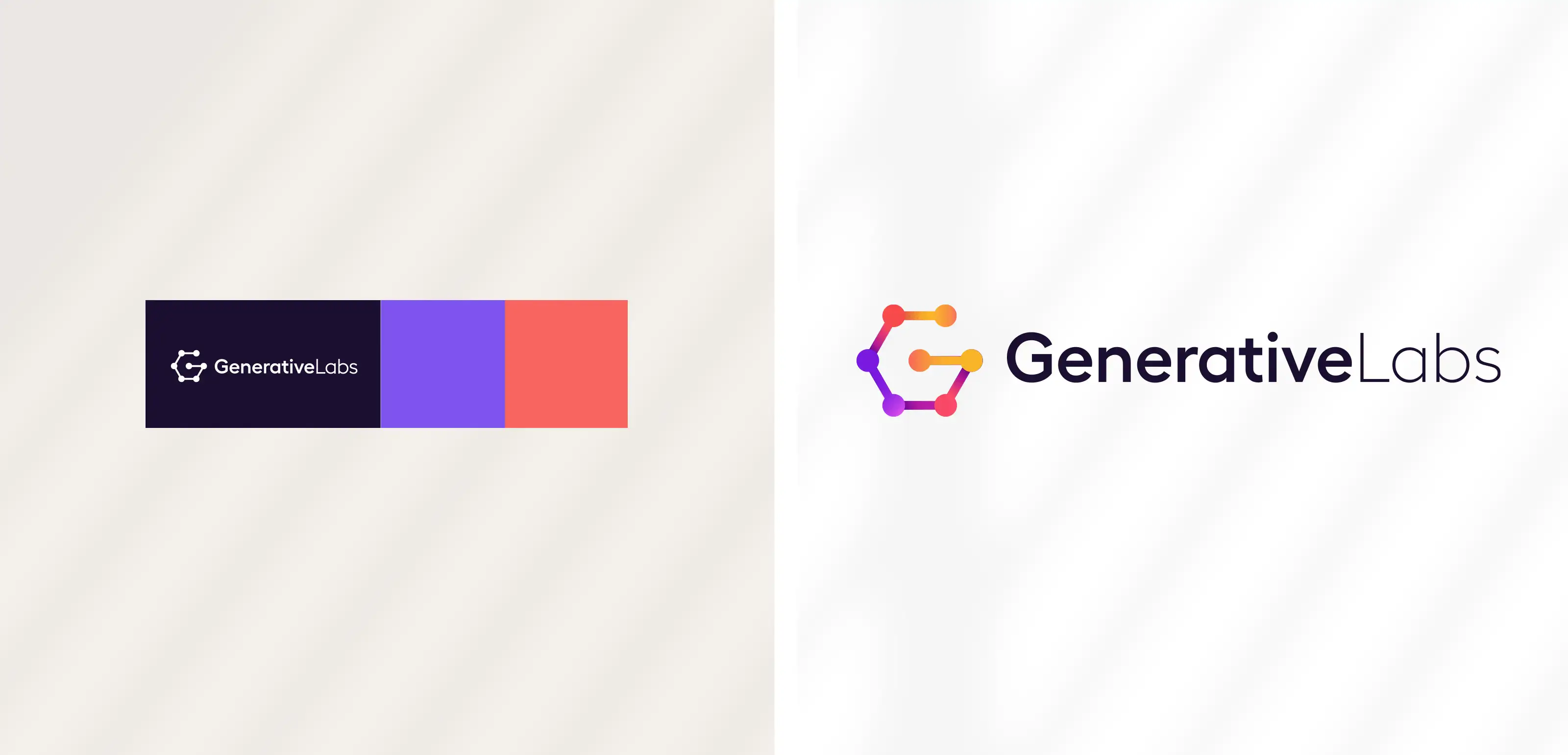
| 2024 |
Orbita Health
The logo for Orbita Health, a leading provider of intelligent virtual assistants and automated patient engagement solutions, features a lowercase logotype and an integrated, two-toned blue mark. This mark's overlapping arcs are specifically designed to represent the seamless, secure connection and communication facilitated by the platform between its three core users: the patient, provider, and doctor/care team.
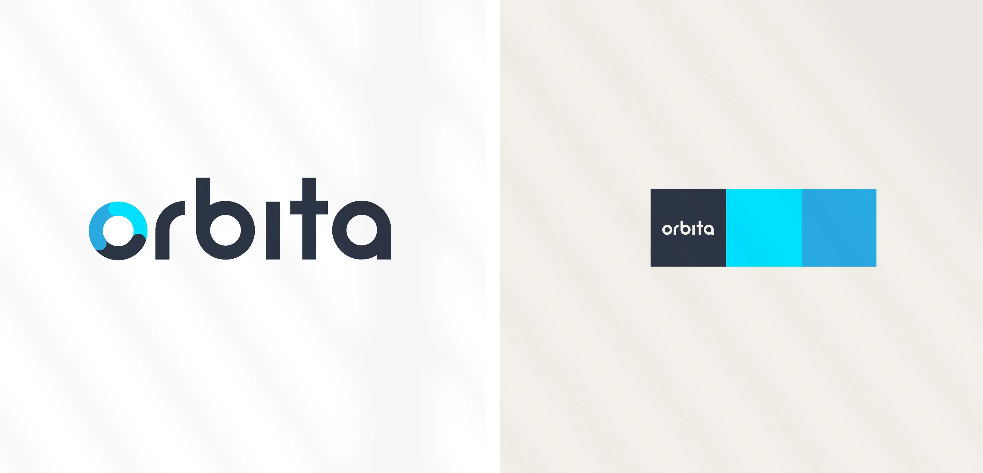
| 2015 |
Washington Mills Lofts
The Washington Mills Lofts is a residential apartment property in Lawrence, MA that was redeveloped from a former woollen mill. Chose a bright, inviting color palette of orange, green, and natural tones and featured a circular WM mark that was inspired by the building's industrial legacy of gears and canal machinery.
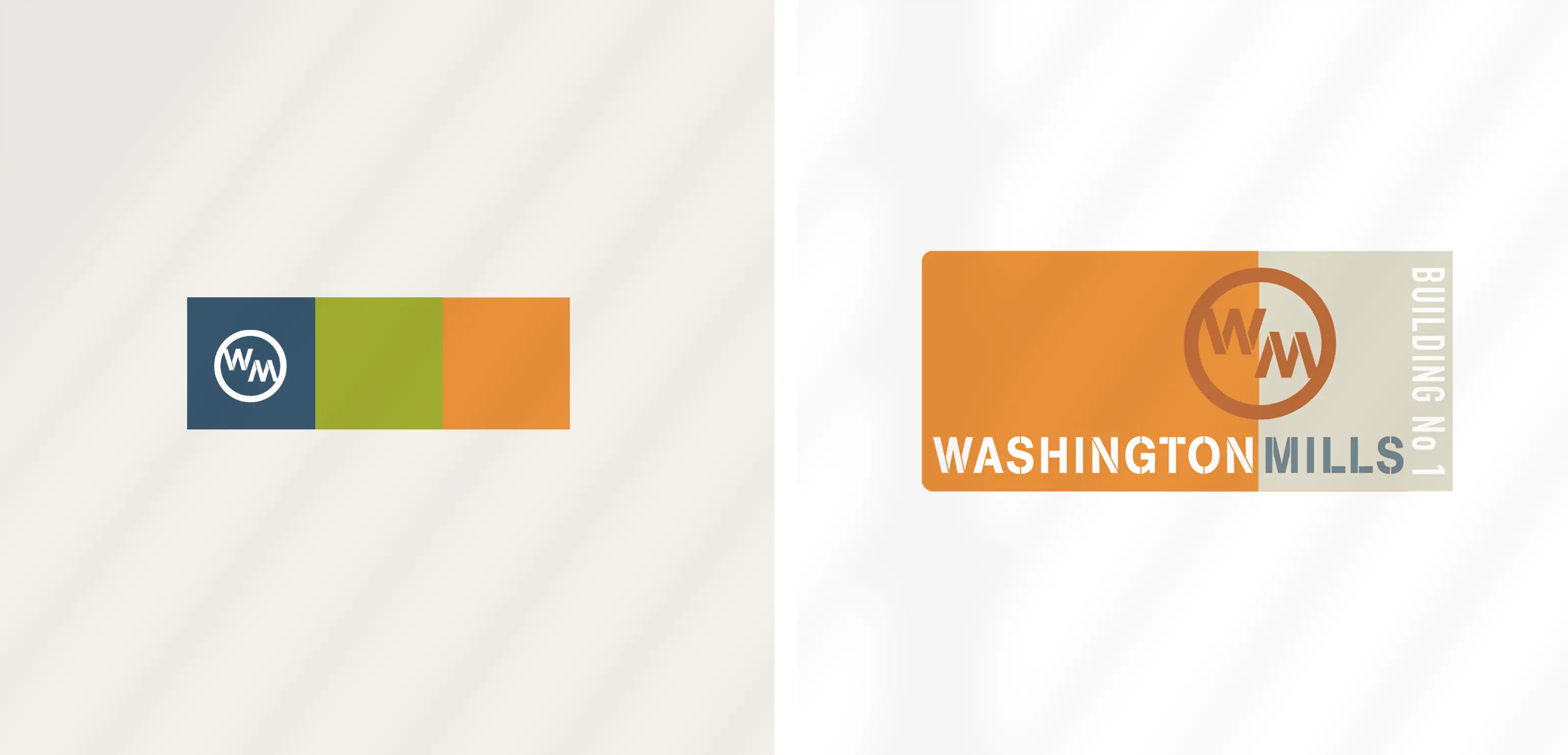
| 2007 |
Empirix President's Club
Designed a multi-day corporate Bahamas meeting logo for a communications client Empirix. Went with a "retro club" look, the central sunburst cleverly functions as both tropical sunshine and communication signals. The design uses a high-contrast lime green and dark gray palette to define the exclusive, island-themed atmosphere.
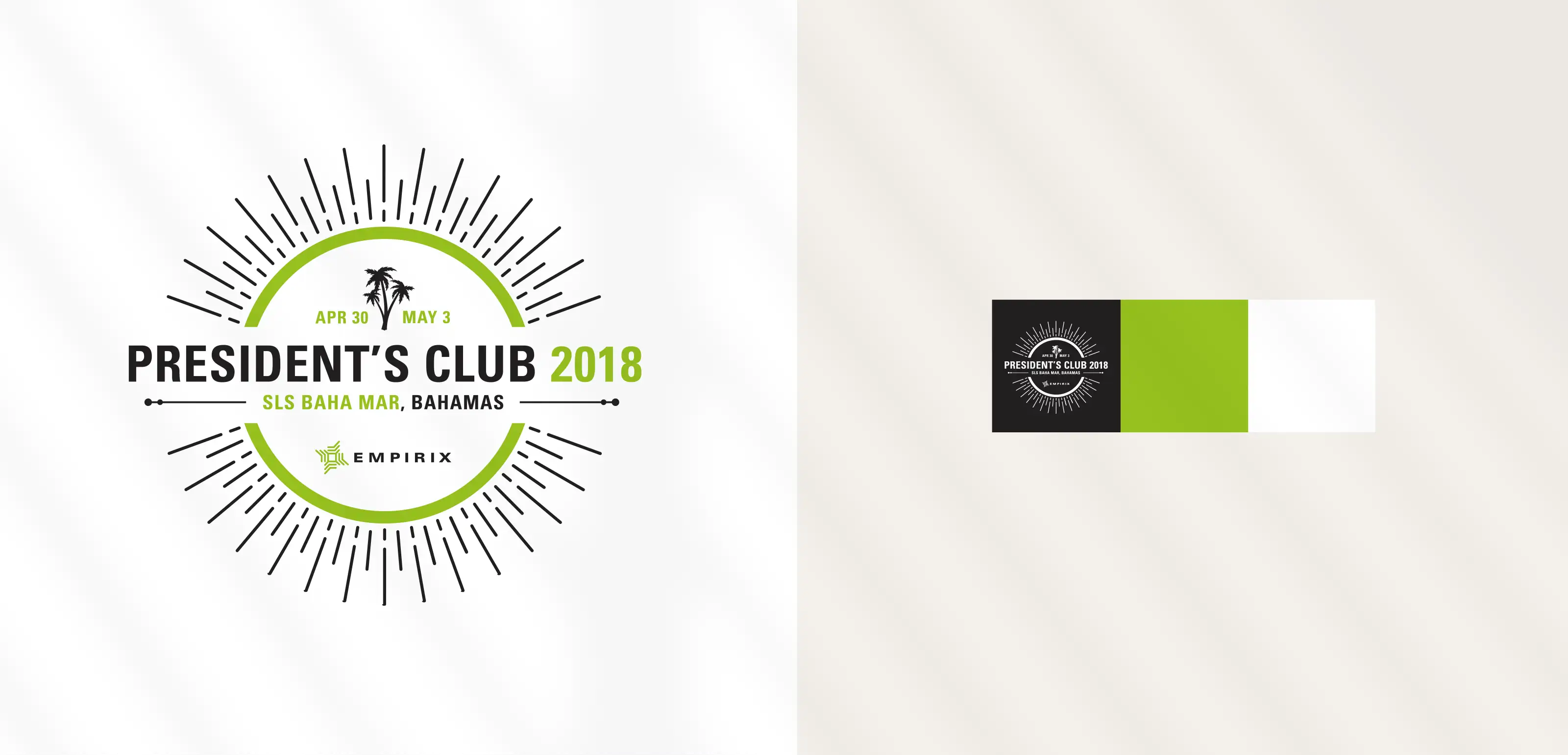
| 2018 |
Nyxeia
This modern logo for Nyxeia, a New York-based firm specializing in smart software solutions and information governance, uses a lowercase logotype with an abstract, four-pronged mark. The mark's vibrant, multi-color gradient suggests a burst of insight and high-speed data flow, visually communicating the company's focus on unlocking information assets.
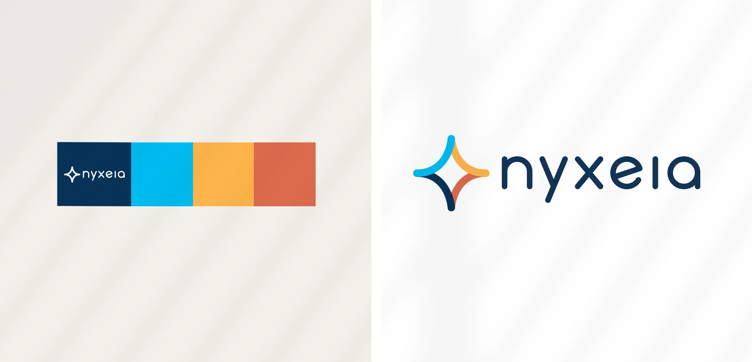
| 2020 |
Runtrackr
The mark uses dynamic negative space and segmented lines to represent a runner in motion, emphasizing speed and data tracking. The palette utilizes light, bright greens to establish a clean, energetic, and user-friendly aesthetic while playing on New Balance's visual idenity. This concept logo for a RUNTAKR fitness app was used in an RFP proposal to NB shoes.
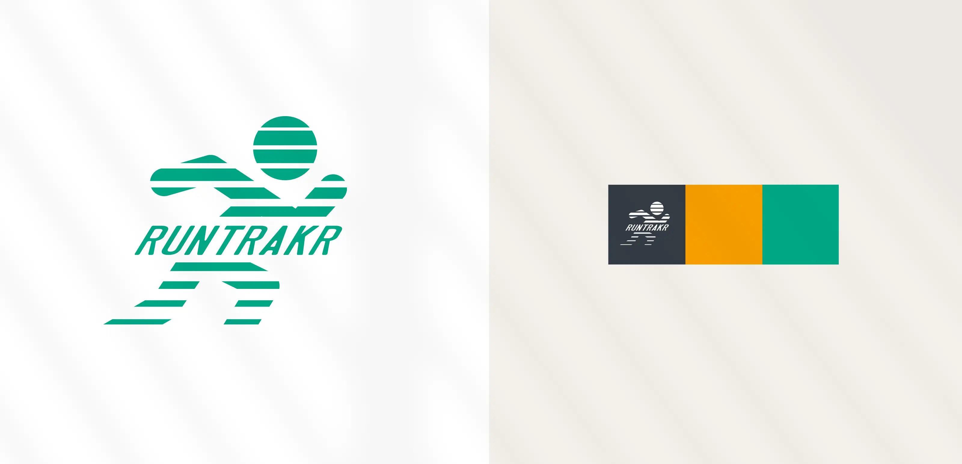
| 2007 |
Agatha Prism
This logo was designed for Agatha PRISM, a user interface for the company's life sciences and quality management software. The design uses a prism icon to symbolize focused insight being refined into useable data. The mark shows insight entering and refracting into clear, actionable data (green and yellow rays), effectively branding a clean, modern user experience.
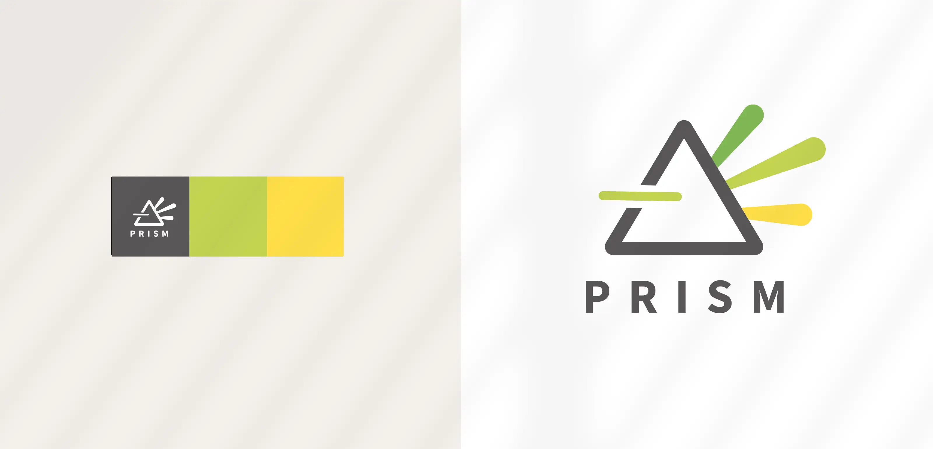
| 2021 |
ai12z
ai12z is a cutting-edge chat AI assistant tech start-up that provides seamless artificial intelligence LLM's and connectivity to users. Modern brand identity, featuring a dynamic, cycling logo in a blue-teal palette, visually captures data flow, trust, and continuous innovation.
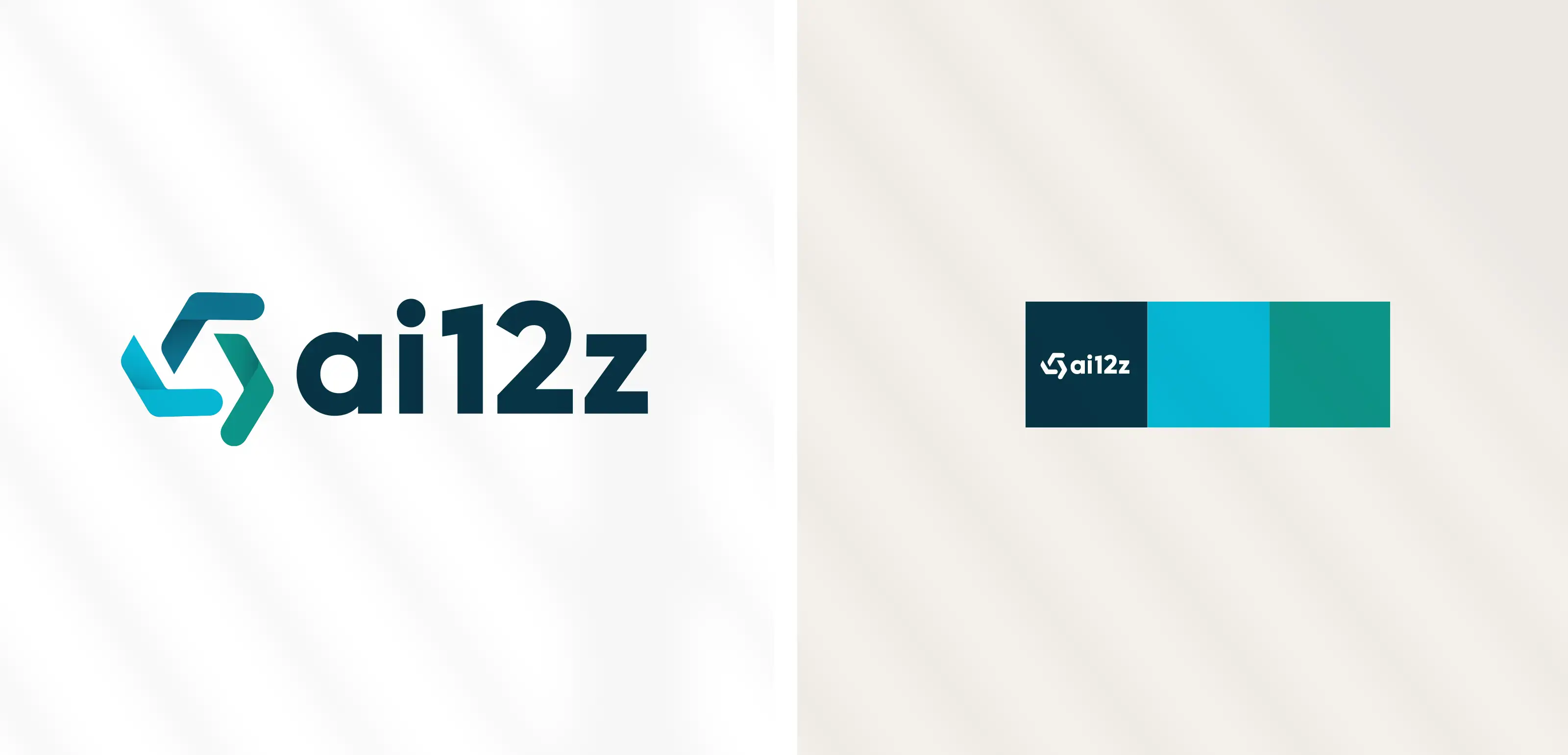
| 2023 |
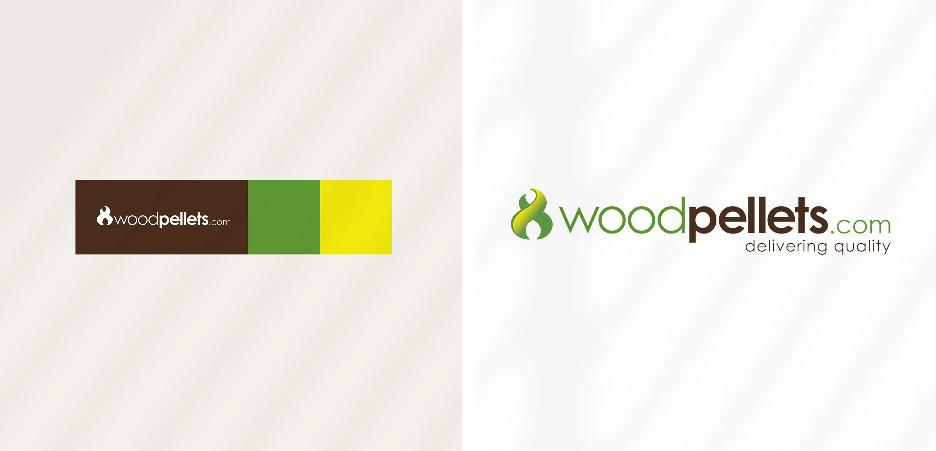
Woodpellets.com
The design for WoodPellets.com, an e-commerce platform for alternative heating fuel, combines a friendly, modern font with an identifiable symbol that represents heat, quality, and sustainability. The primary mark integrates a tribal flame symbol and suggests an infinity loop to convey the dual concepts of heat and renewable energy. The logo's color palette utilizes earth tones, specifically pairing brown for the wood source with green to communicate the commitment to renewable energy and natural quality.
| 2009 |
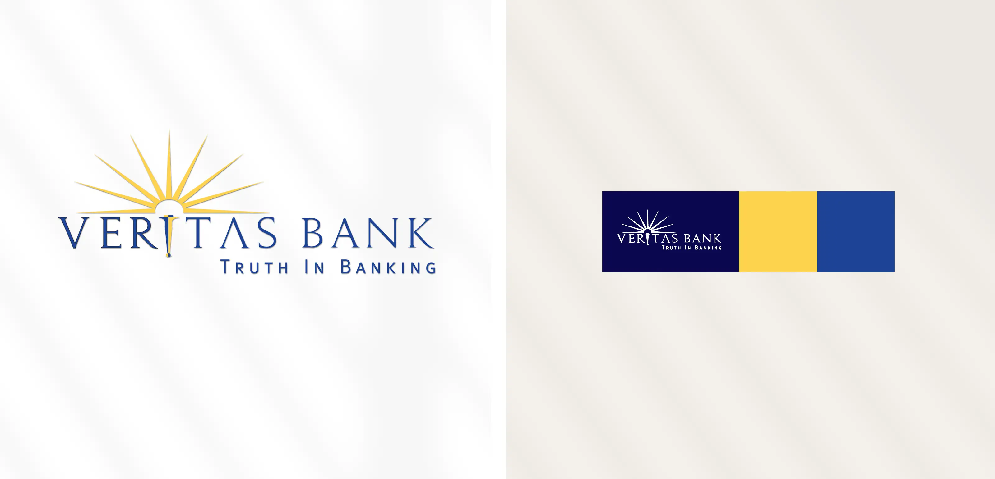
Veritas Bank
The design for Veritas Bank is a classic brand identity built on the pillars of trust, tradition, and "truth in banking." The logo features a classic serif font and an iconic sunburst and torch, symbolizing clarity, stability, and tradition. The palette uses rich, deep blue to convey trust, contrasted with a strong gold that symbolizes power, wealth, and enduring financial integrity.
| 2007 |
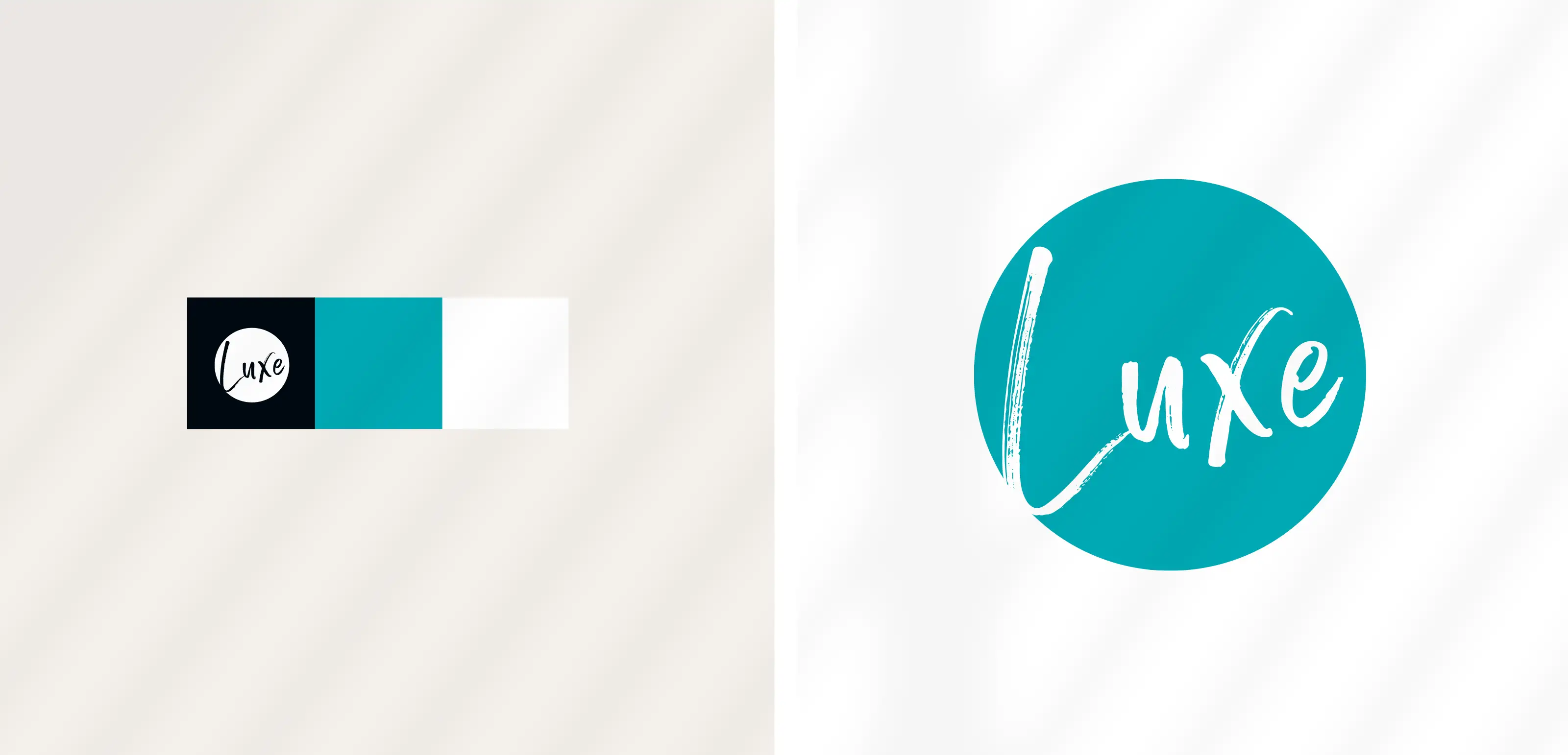
Luxe Property Management
The design for Luxe properties, featuring luxury homes in the northern part of Maine, was developed to target both winter and summer rentals. The logo pairs a simple circular shape with a free-spirited, painterly script. This conveys artistry and a worry-free experience by suggesting a human touch to the exclusive experience. The tranquil teal color palette suggests quality, escape, and a rejuvination.
| 2020 |
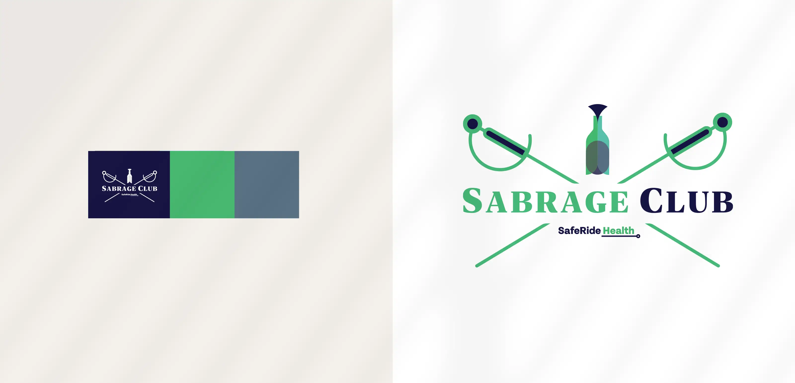
Sabrage Club
An event logo for 'Sabrage Club', a corporate meeting sponsored by SafeRide Health that conveys a premium club vibe. The design features a champagne bottle celebratory sabrage theme. The color palette uses deep navy and greens/blues directly aligned with SafeRide Health's brand identity.
| 2025 |
HVAC 360°
The HVAC360° logo combines bold, modern typography with a clean two-color palette. The warm golden yellow in “HVAC” represents energy and reliability, while the cool charcoal gray in “360°” balances it with precision and clarity. The degree symbol plays on both temperature and a complete 360-degree view, capturing the brand’s focus on comfort and full-system awareness. The result is a simple, smart, and dependable mark.
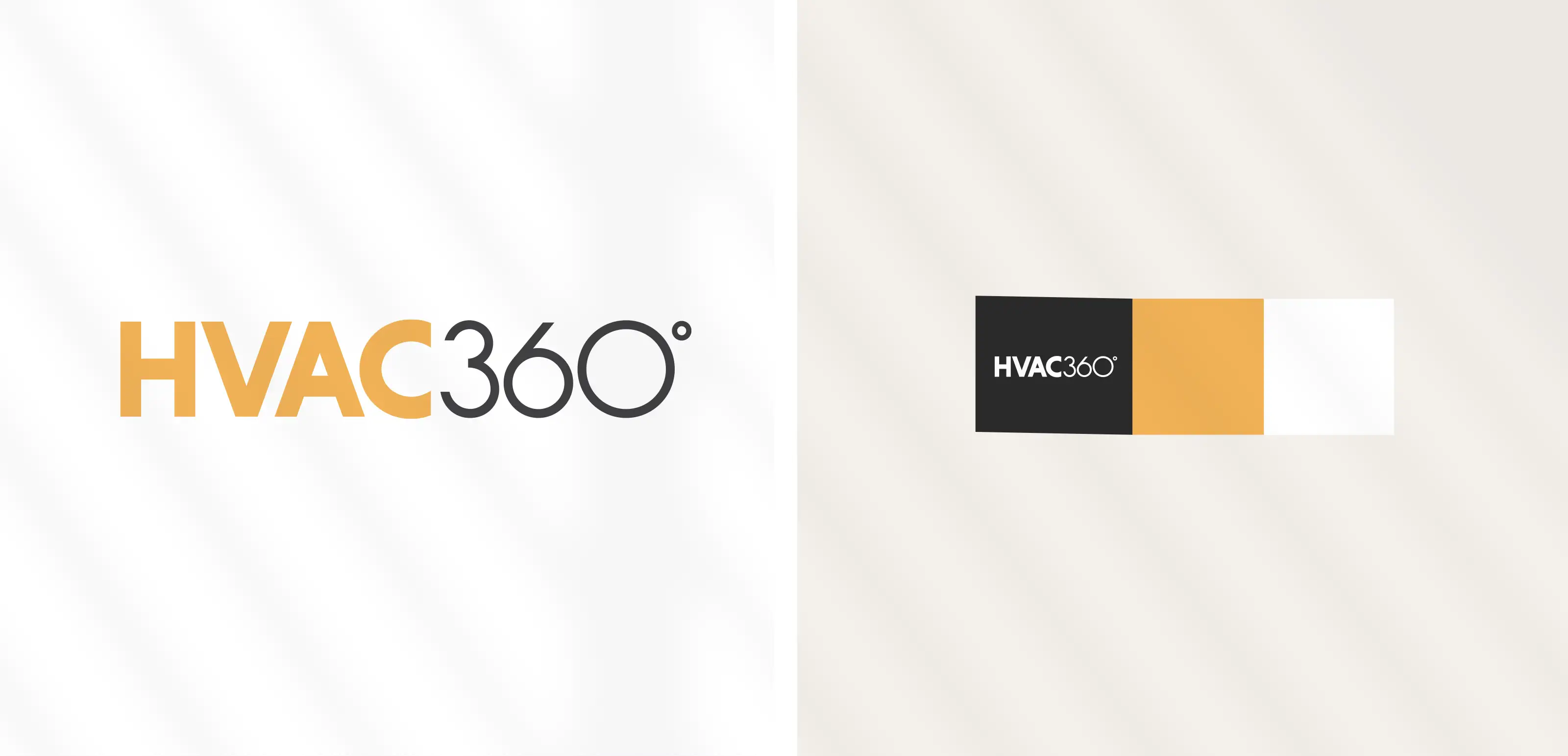
| 2020 |
VXD, Voice Experience Designer
The logo for VXD uses modern, simple typography playing with the symbol that represents a voice wave or data wave formed by overlapping, curved lines. VXD is a user interface mapping tool that voice designers can use to easily design voice experiences. The wordmark, set in a clean, low-profile sans-serif typeface in a dark charcoal color, balances the symbol's energy.
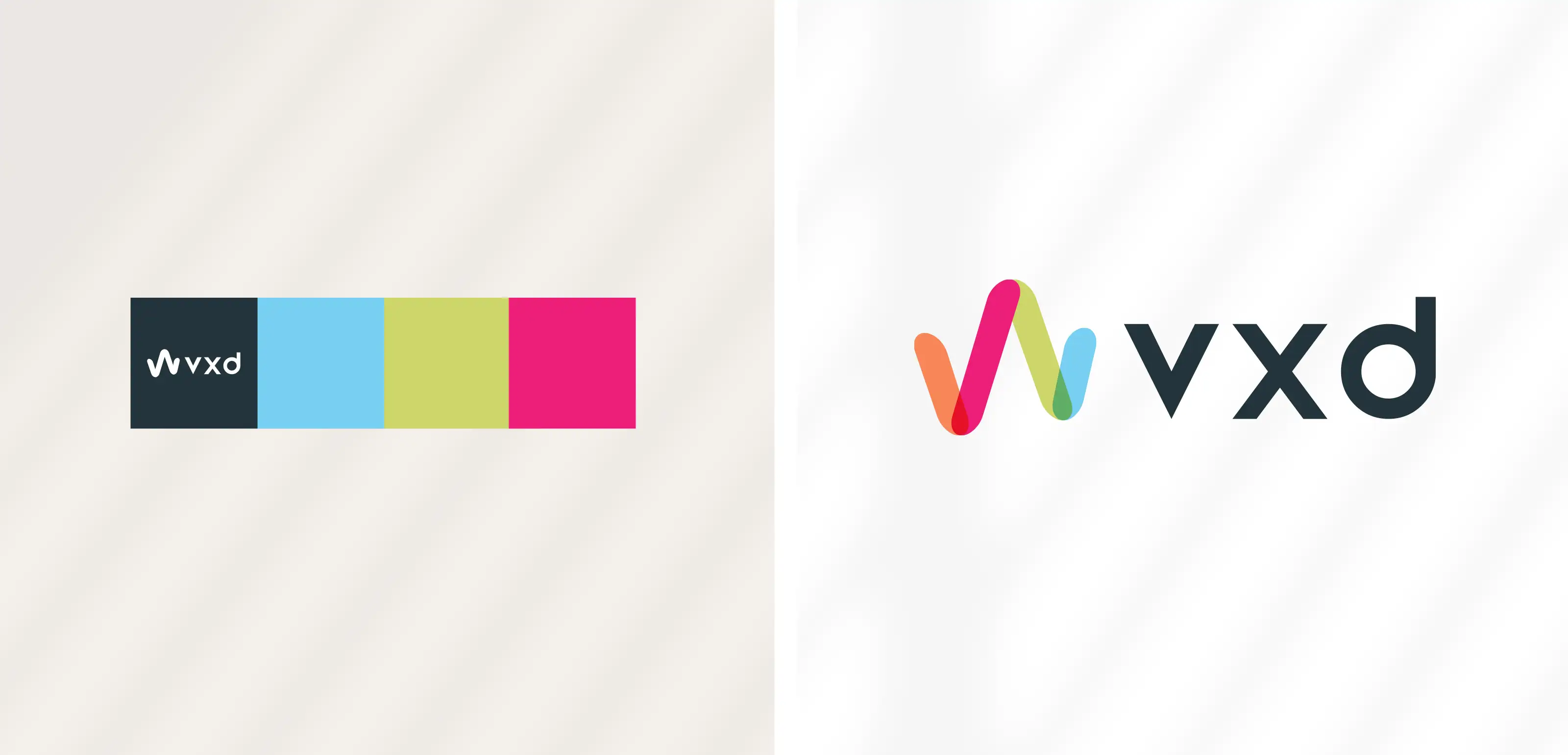
| 2017 |
Complete Disinfection Services
CDS (Complete Disinfection Services), a NH cleaning company created in response to covid and demand for sterilization services, intentionally uses a design that mimics popular commercial cleaning products. The acronym CDS is set in block letters with a blue gradient for a clean, fresh look. The 'S' includes a sparkle element, referencing disinfection and safety. A silver-gray swoosh orbits the name, suggesting a complete service offering. The aesthetic was meant to be highly recognizable and dependable.
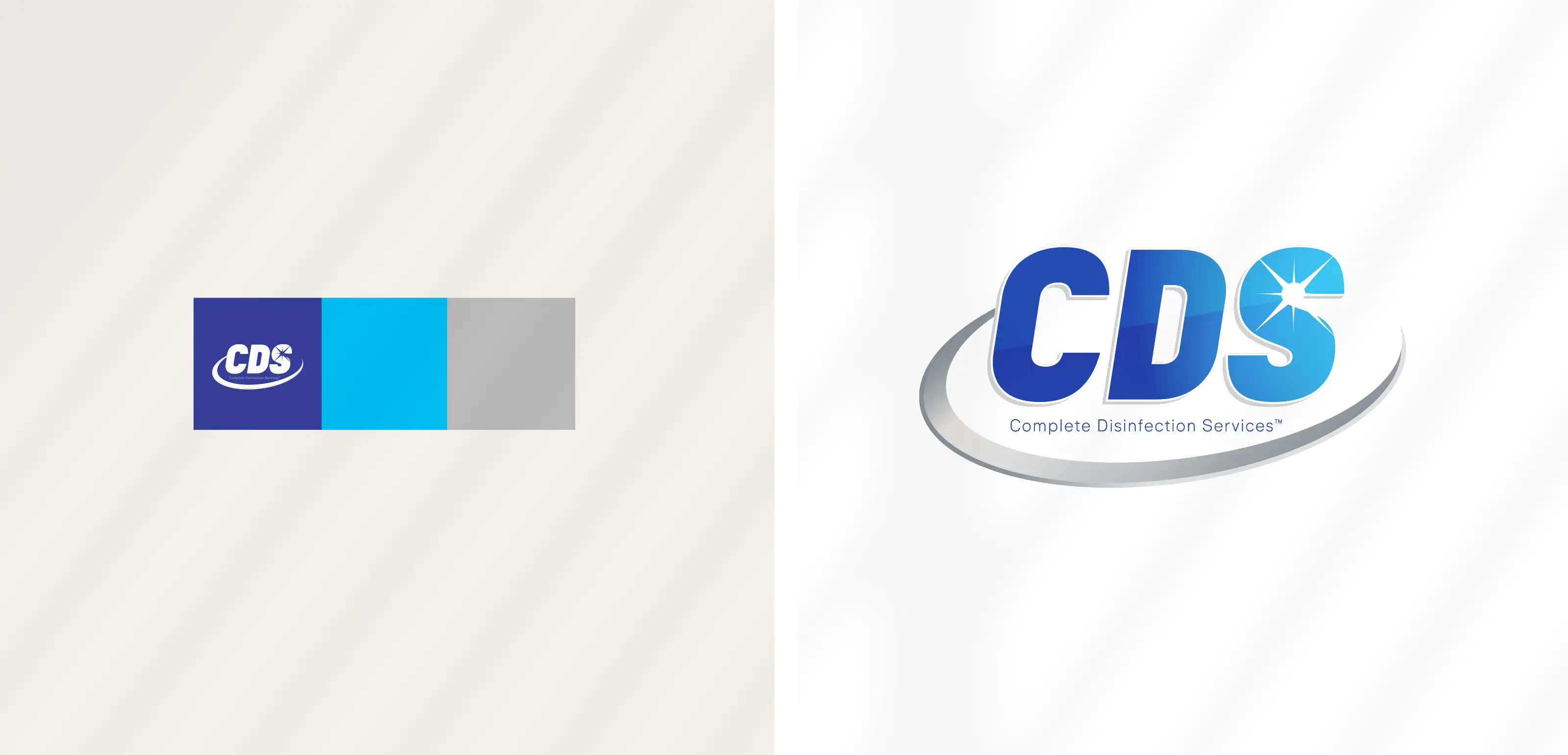
| 2020 |
Diamond Bill Risk Management
The DHR mark, illustrates mountains with snowy peaks, creating negative space that powerfully symbolizes stability and the financial challenges the firm helps clients overcome. The icon's upward angles convey a sense of strength and structure. This 2 color traditional corporate palette of navy blue and bright blue conveys clarity, trust, and professionalism.
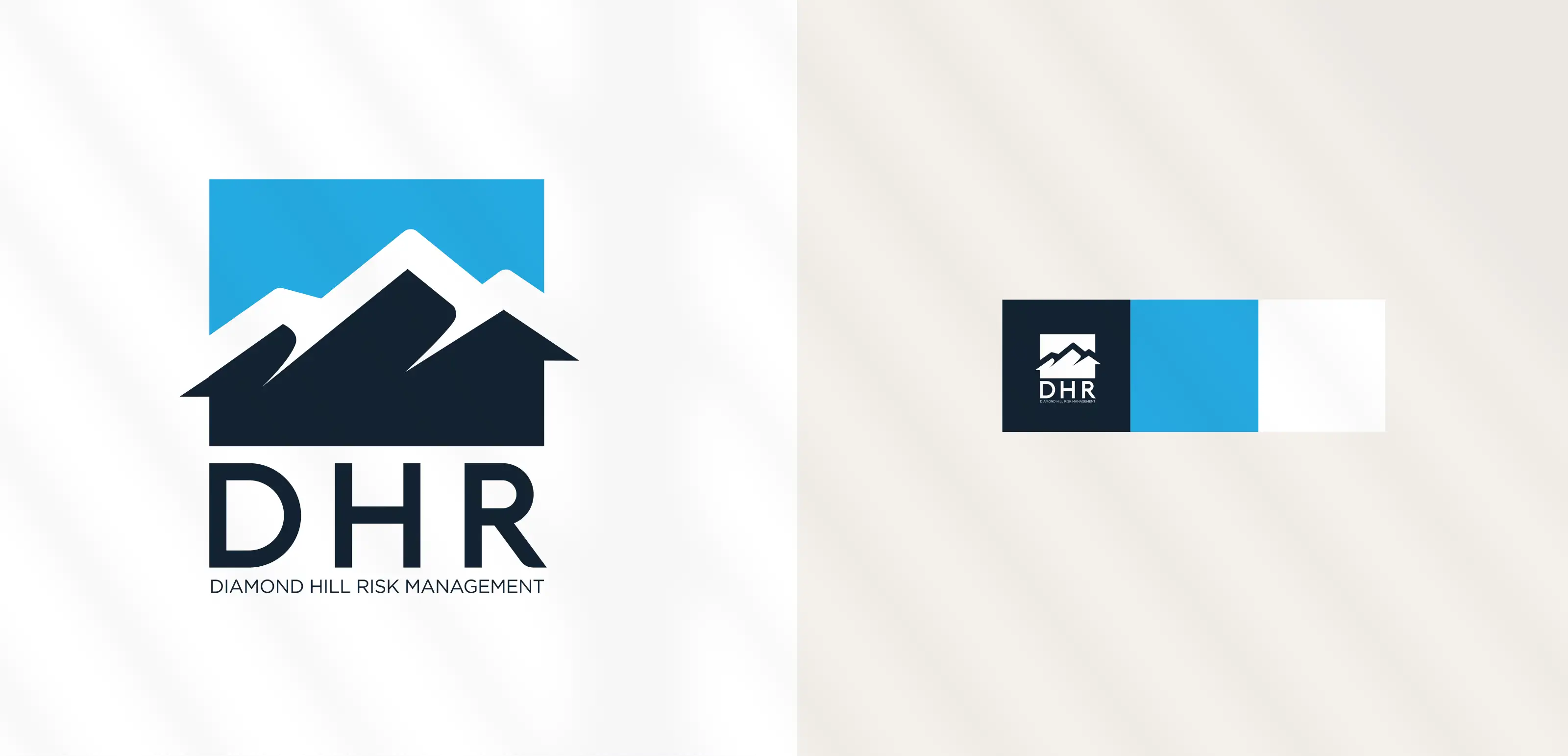
| 2018 |
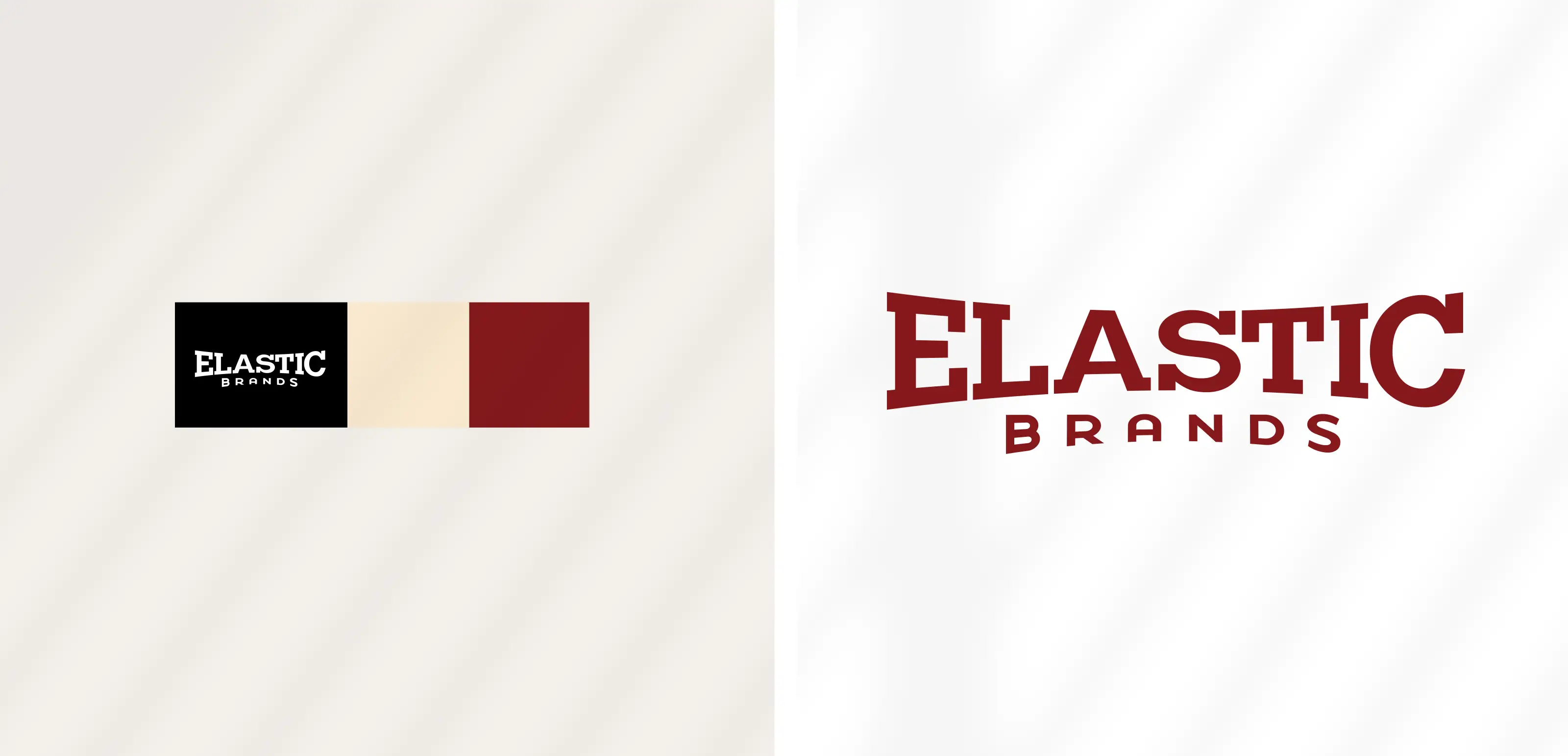
Elastic Brands
Bold, flexible typography captures the balance between strength and adaptability—showing that a brand can be both confident and dynamic while leaving room to evolve. Elastic Brands help companies build identities that can move and grow.
| 2006 |
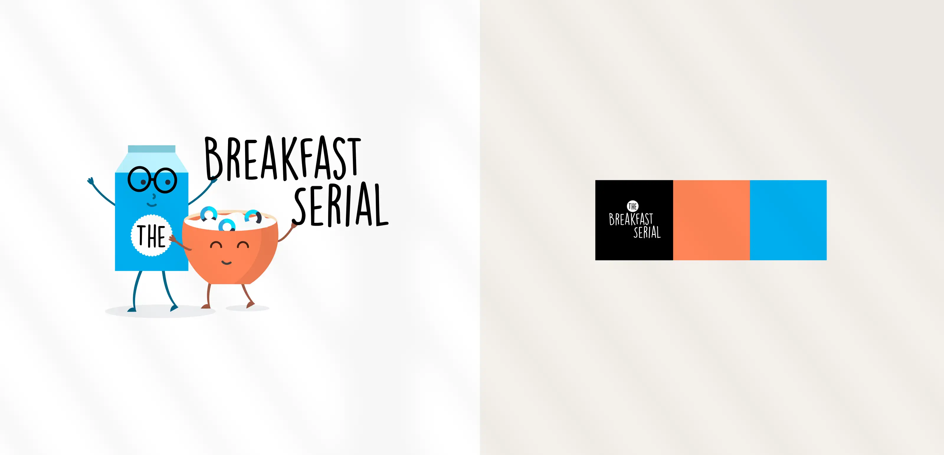
The Breakfast Serial Podcast
This design for "The Breakfast Serial" , a morning time podcast (created for Orbita Health, a healthcare technology company) is a fun and playful mark that uses cartoon like characters to create a visual pun on the show's title. The simple, high-contrast color palette and hand-drawn typography make the logo feel light, fun, and approachable while representing Orbita's corporate visual style.
| 2023 |